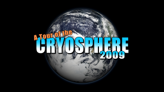
 Back in 2002, NASA created a film using satellite data that took viewers on a tour of Earth’s frozen regions. This year, NASA visualizers are taking viewers on a return trip to see how things have changed over the years.
"The Tour of the Cryosphere 2009" combines satellite imagery and state-of-the-art computer animation software to create a fact-filled and visually stunning tour that shows viewers the icy reaches of Antarctica, the glacier-pocked regions along the Andes Mountains, the winter snows of the American West, the drifting expanse of polar sea ice, and the shrinking Jakobshavn glacier in Greenland.
However, viewers who saw the original will notice differences in the new version, also created by the Scientific Visualization Studio (SVS) at NASA's Goddard Space Flight Center, Greenbelt, Md. The new "Tour of the Cryosphere" video can be seen and downloaded from the Scientific Visualization Studio's Web site.
"What we did was incorporate more recent data and kept all scenes from the original that were dramatic and interesting," said film director and editor Horace Mitchell, who began updating the animation seven months ago, with help from visualizers Alex Kekesi and Cindy Starr. "The biggest change is that the entire film is in high definition.”
Another significant difference is evident as soon as the 5-minute animation opens. At the request of Earth scientists, who thought the film could be improved by a more realistic rendering of Antarctica, the team replaced the original imagery provided by Canada’s RADARSAT with the Landsat Image Mosaic of Antarctica (LIMA). Created from more than 1,000 high-resolution Landsat 7 scenes, the LIMA dataset seamlessly shows the entire continent in unprecedented and realistic detail.

The new version of "A Tour of the Cryosphere" features the world’s highest-resolution map of the icy continent, from the NASA-USGS Landsat Image Mosaic of Antarctica (LIMA) project. Credit: NASA/USGS
› Larger image
› Larger image
As the updated film takes viewers northward from Antarctica, the film treats viewers to the precise locations of glaciers scattered along the Andes Mountains in South America. The locations literally pop as the film continues its grand tour toward the planet’s northern climes.
After a quick tour of snowfall in the American West and its impact on vegetation in 2002 and 2003, the film moves across Canada and Alaska to show more recent satellite data of annual snow and ice overlaying these regions. From there, viewers travel to Earth's North Pole where they see the monthly average concentration of Arctic sea ice in 2009.
To help drive home the point that minimum sea ice levels have declined dramatically since 1979, the SVS team inserted a chart that tracks the levels of minimum ice cover, which typically occurs in September.
The animation then moves from Arctic sea ice to Greenland. More recent data now are used to show changes in the Jakobshavn glacier, which receded only slightly from 1942 to 2001. Beginning in 2002, the rate of ice loss jumped dramatically. The film shows the continued rates of recession over the past four years.
The animation shows the world in a single "shot" -- uninterrupted by cuts or scene changes, a technique that conveys the interconnectedness of the cryosphere and the reason scientists gather satellite data to monitor changes in the first place.
The film gives anyone who watches it a wealth of data collected from satellite observations, showing in detail the impact that recent changes are making on the planet, he said.
"We’re trying to tell NASA’s story with Hollywood's tools," Mitchell said.
Related Links
› NASA Goddard’s Scientific Visualization Studio
› Landsat Image Mosaic of Antarctica (LIMA)


0 comments:
Post a Comment